BuildOS
A design system AI agents design and build products from
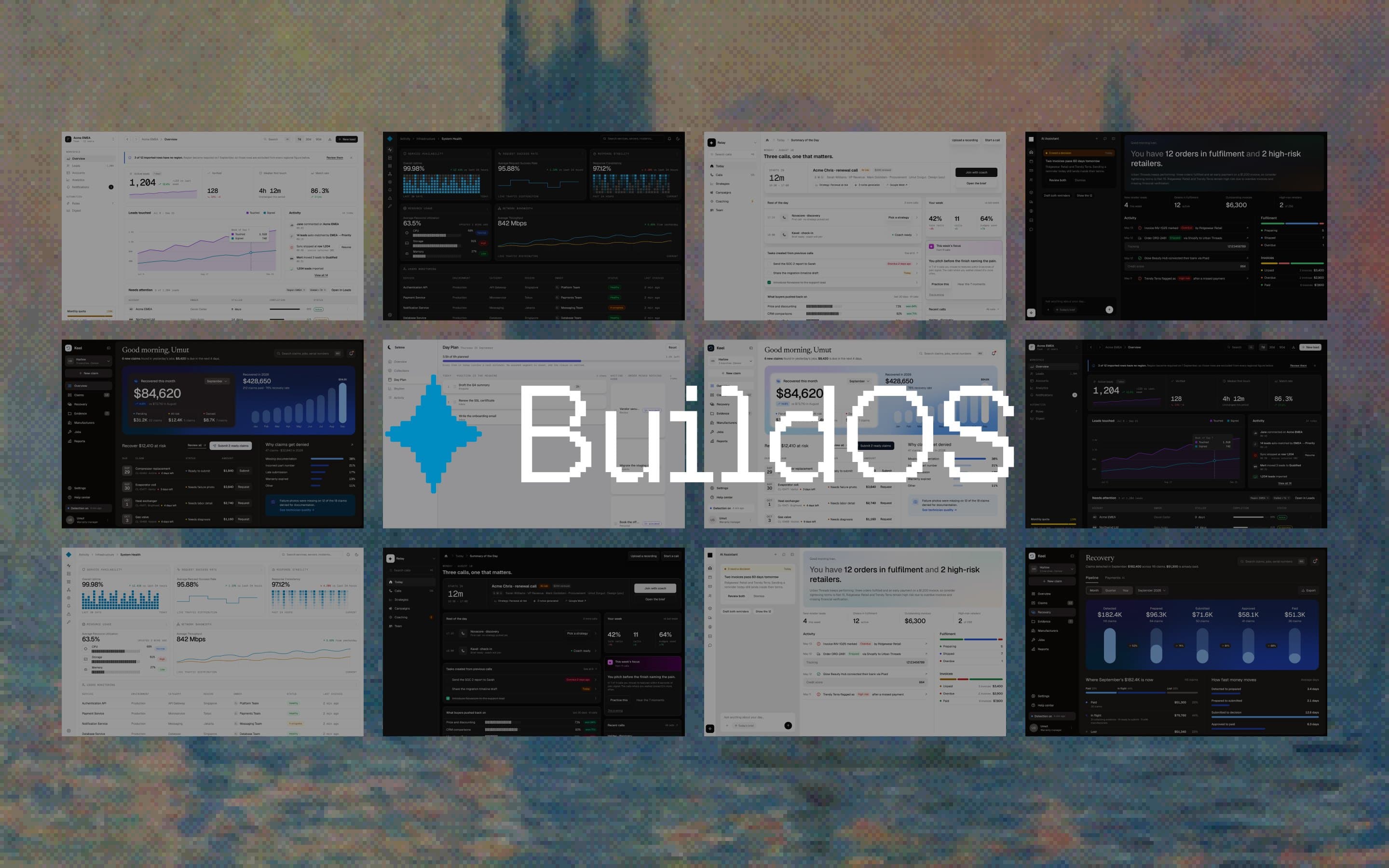
A product starts as an idea and leaves as a working design system of its own, with every screen in every state, and the app that follows is built to the same rules. I designed the system and the rules it runs on.
- Year2026
- ClientVizio AI
- RoleProduct Designer, Design Engineer
- ScopeThemes, UX laws, a path from PRD to build and a design check
- Built WithClaude Code, Figma, Next.js
- LiveVizio.ai (opens in a new tab)
- 10+themes
- 20+UX rules and laws
- 1source for design and code
In one line
BuildOS takes a product from an idea to a design system of its own that a team can build that week. I designed it and built it end to end with AI agents.
The problem
Vizio AI builds software for clients on short, fixed timelines, and that software has to stay scalable and easy to maintain long after launch. AI tools can generate screens in seconds. What they can't bring on their own is taste, real usability, or a design system that understands the problem in front of it. Left alone, they leave behind a pile of designs that solves one problem and creates new ones.
The goal was a design system agents design from: one that brings taste and usability to every screen, is built around the people who use the product, and is reused from one product to the next instead of starting over.
Three layers
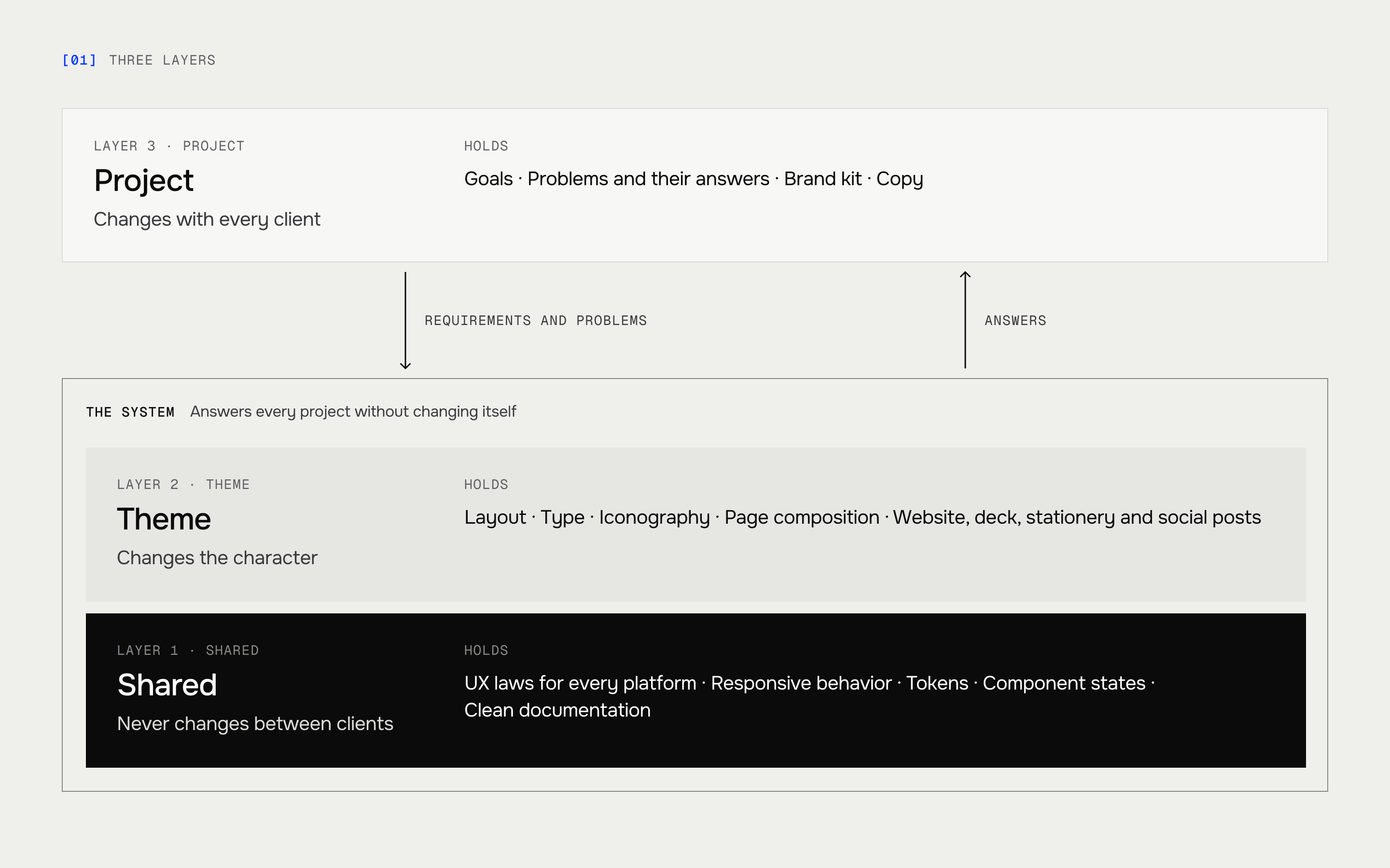
I split the system by how often things should change.
- The shared layer never changes between clients: the UX laws and how they apply on every platform, responsive behavior from phone to desktop, tokens, component states, and documentation that stays clean enough to apply anywhere.
- The theme layer changes the character: layout, type, iconography, page composition. A theme composes the shared components; it never redefines them.
- The project layer holds what belongs to one client: its goals, its problems and the answers to them, along with the brand kit and the copy.
Every project arrives with its own requirements and its own problems. What makes the structure work is that the system answering them is complete enough to do it without changing itself.
More than ten themes
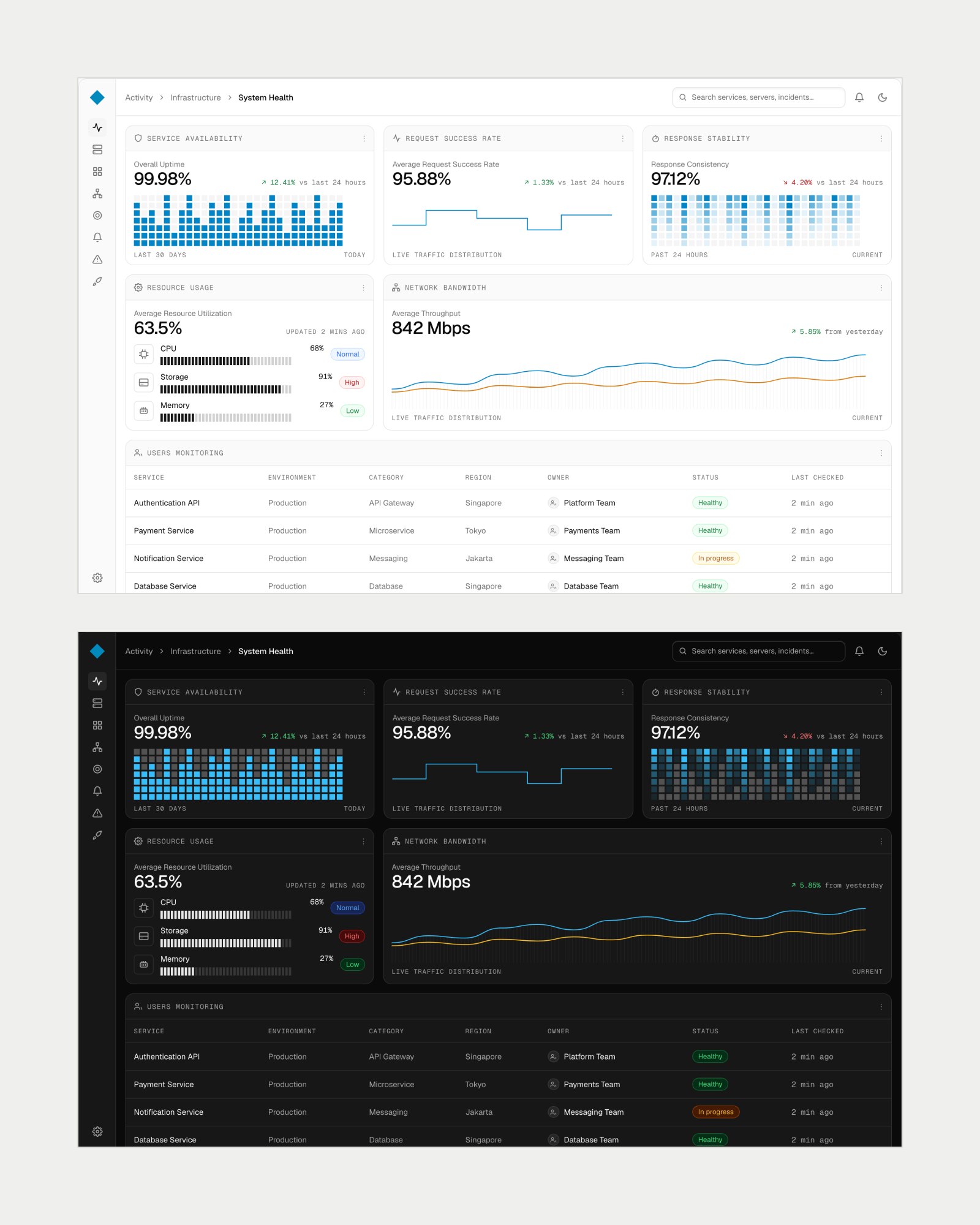
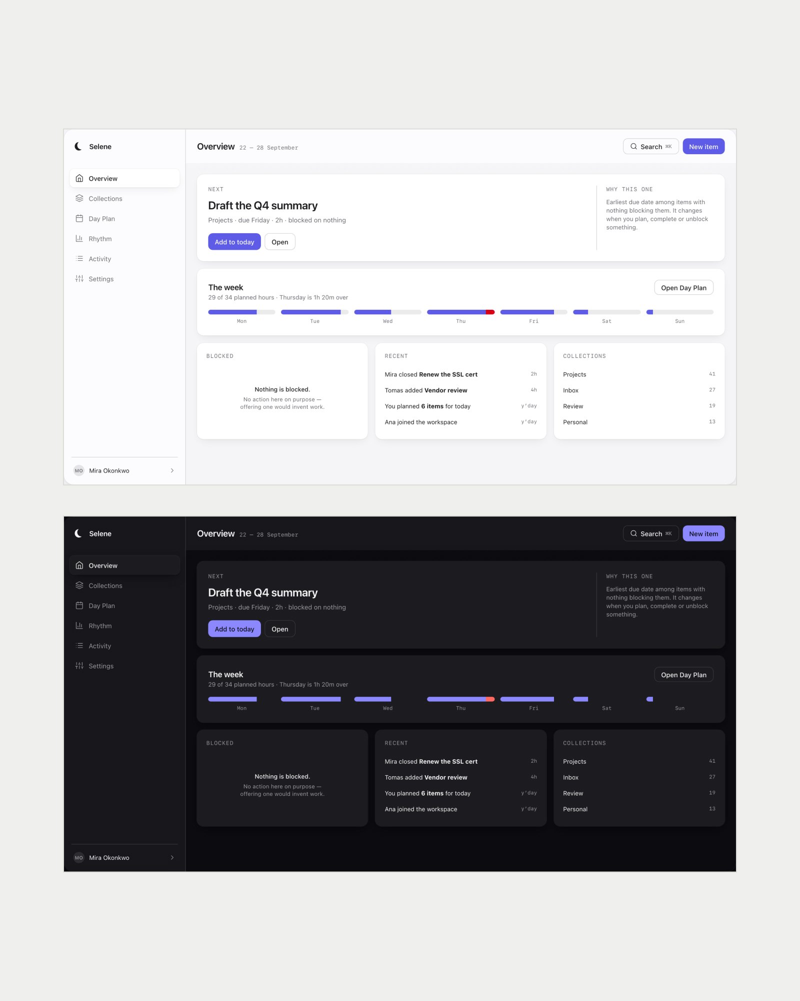
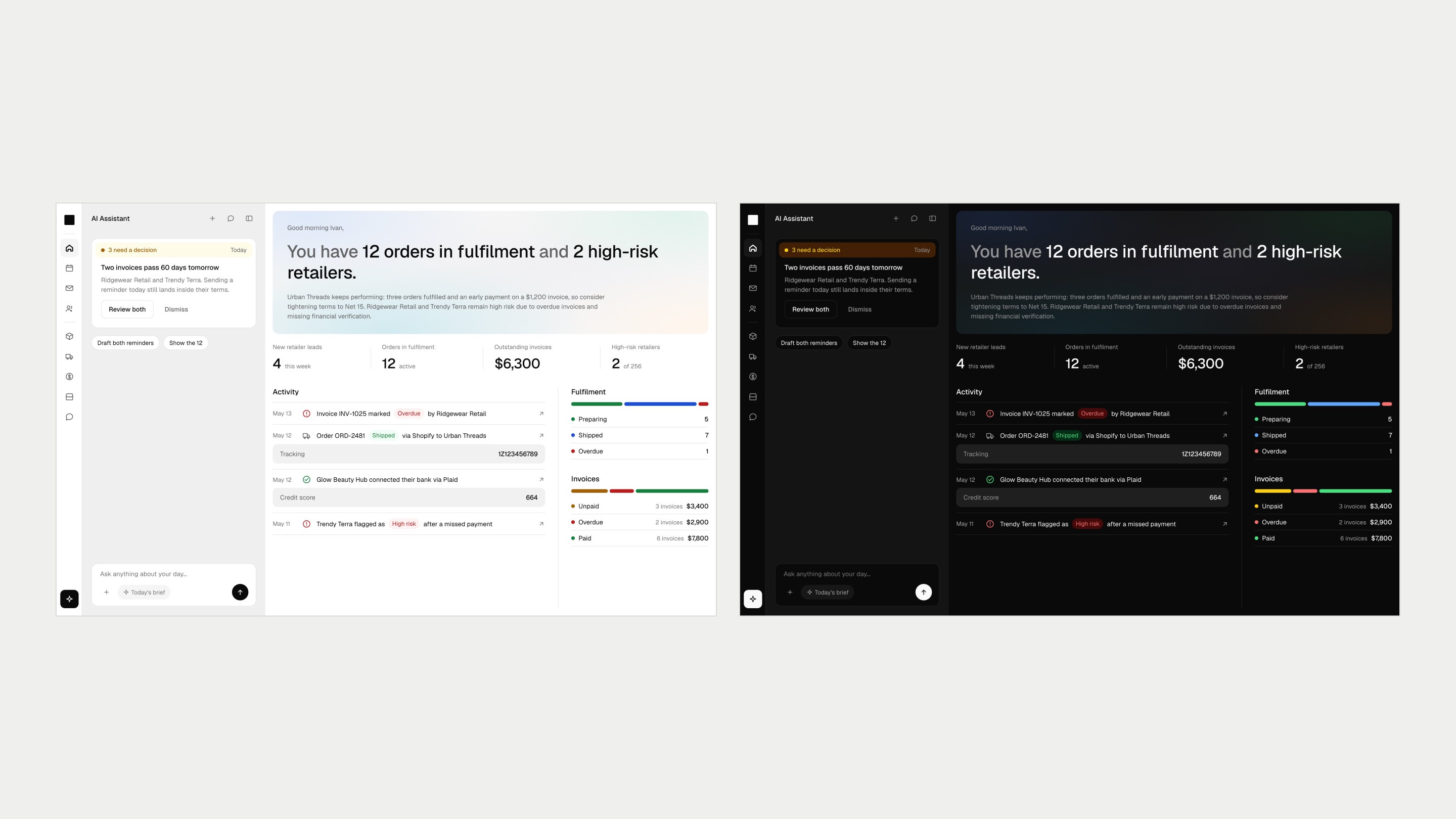
There are more than ten themes now. When Vizio AI moved to its Renaissance identity, the themes took their names from Greek mythology, each named for the character it brings, so choosing one is a conversation with the client rather than a number.
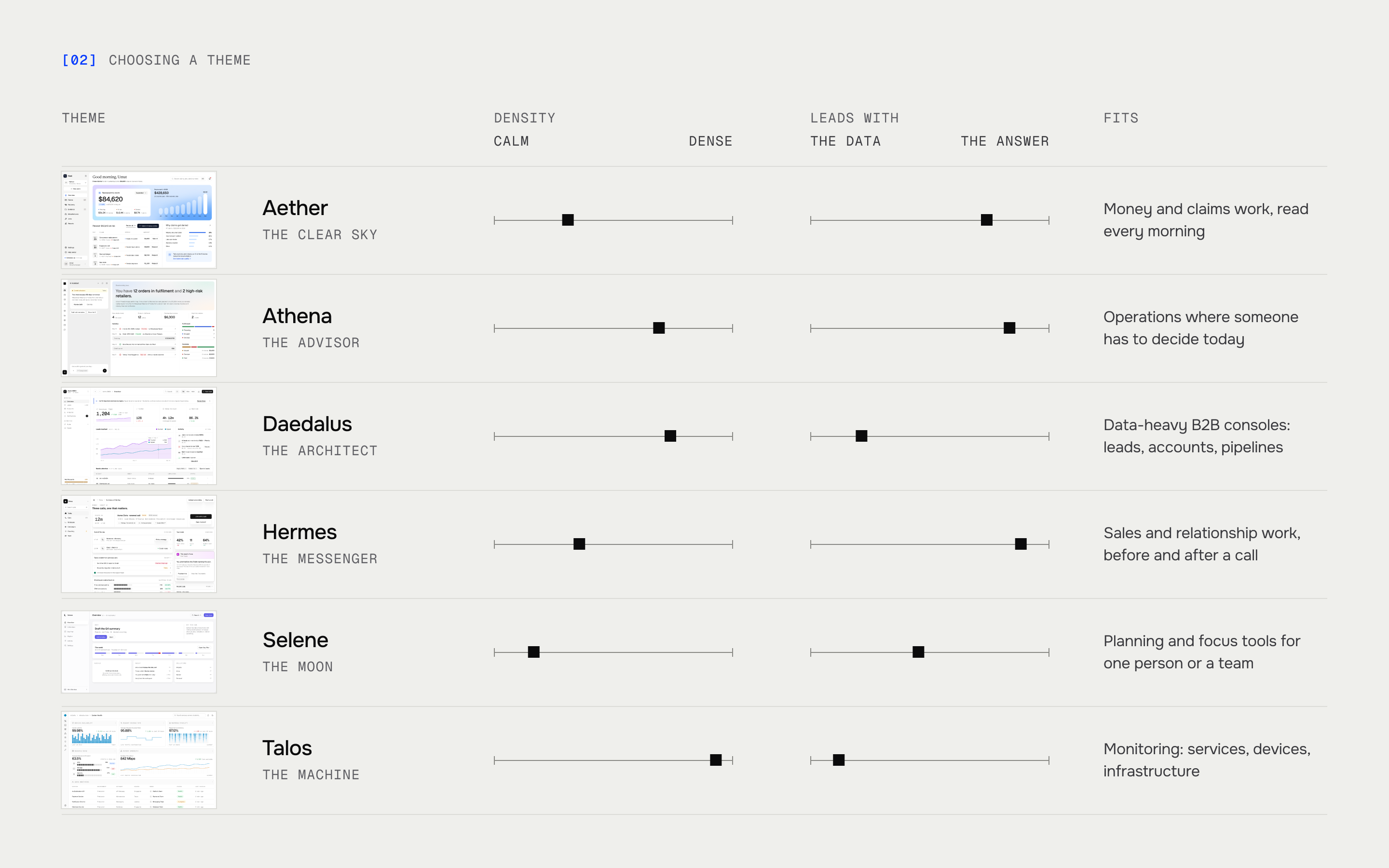
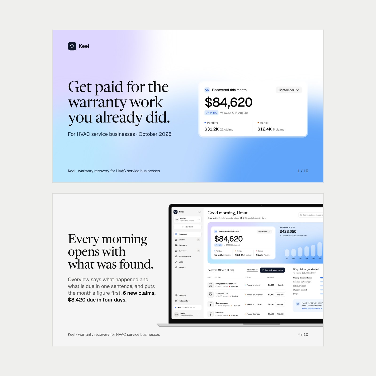
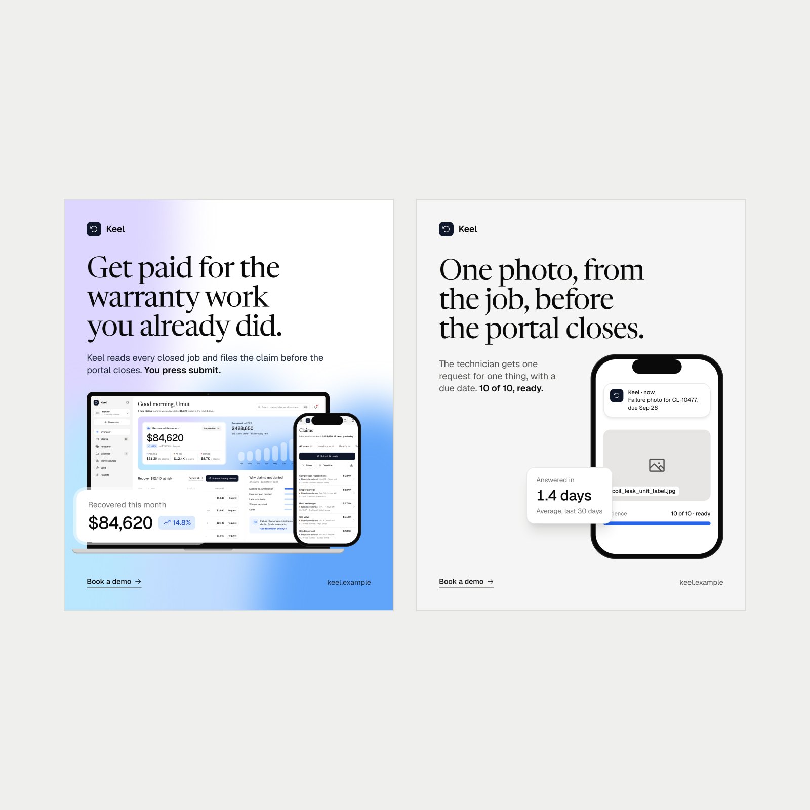
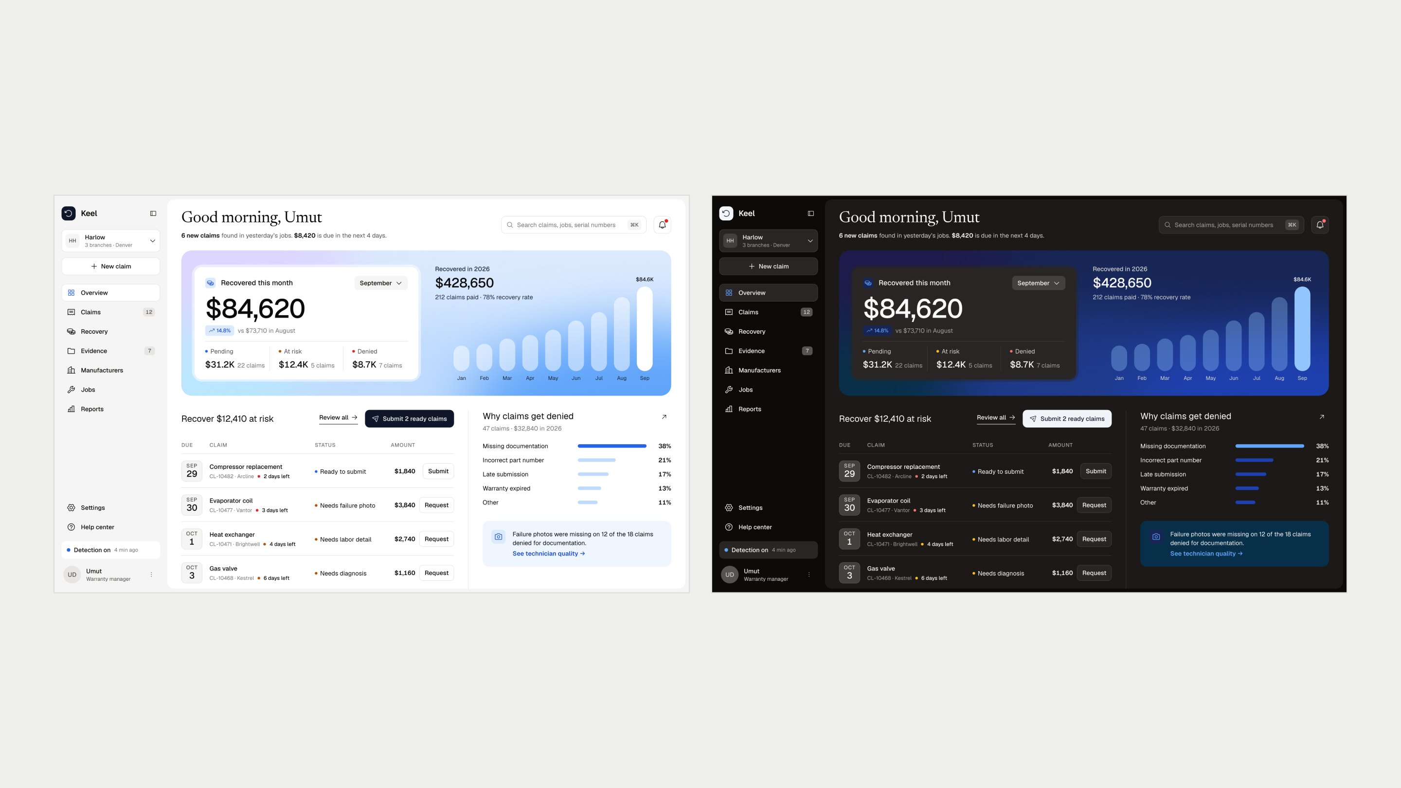
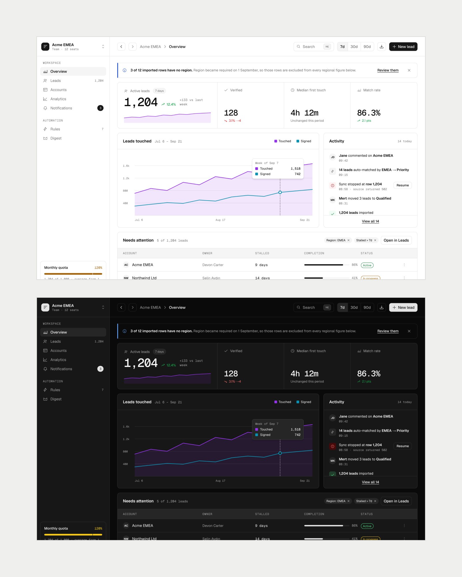
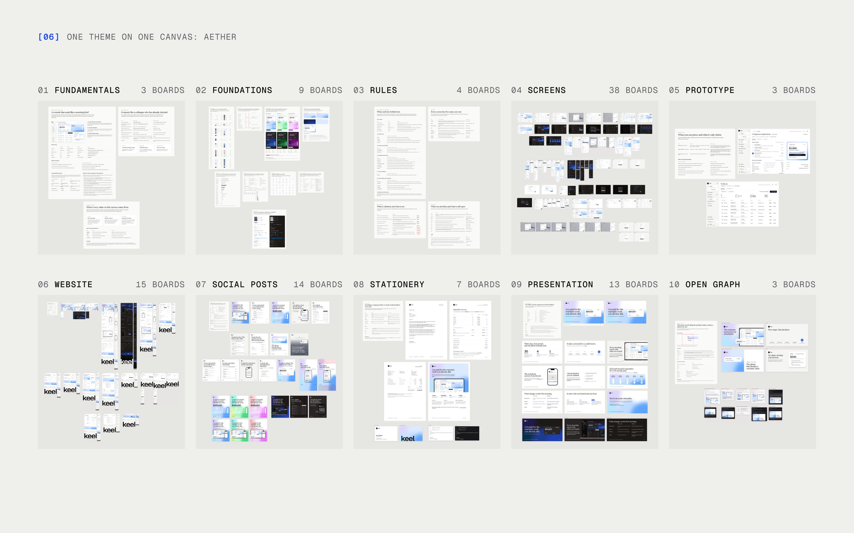
Every theme sits on the same structure and covers the same screen archetypes, so themes can be compared side by side. On top of that, each brings what its character adds: its own signature screens and the touches that suit them.
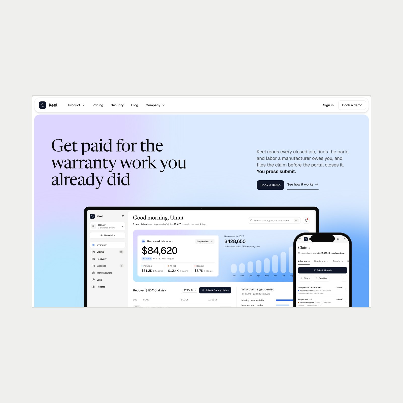
A theme isn't finished at the screens. If it didn't answer everything a product needs, it would be no different from any template on the internet. So each theme is a full design system: it also covers the product's website, deck, stationery and social posts, and puts each of them on a set structure.

UX laws for every platform, written as what they forbid
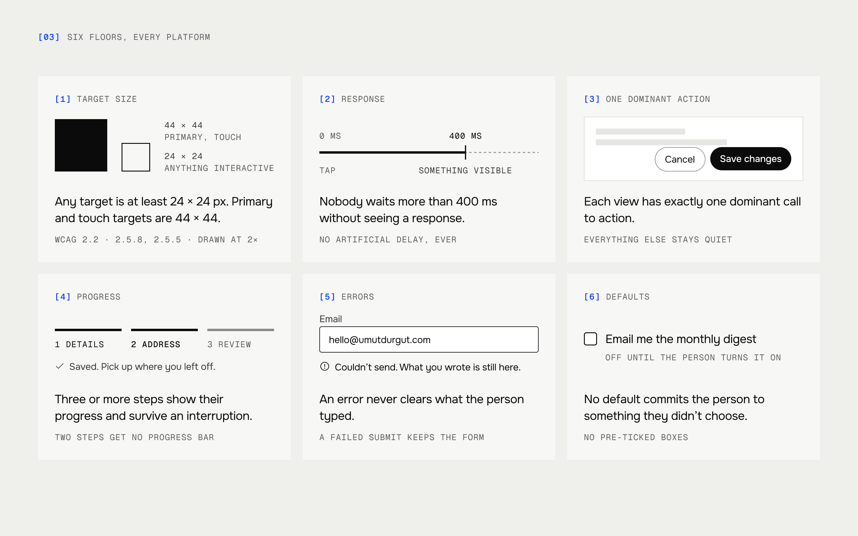
A rule written as a preference ("keep choices manageable") can't be checked. I wrote more than twenty UX rules and laws as prohibitions that hold on every platform a product ships on, from phone to desktop, with six hard floors that are numbers, not taste:
- Any interactive target is at least 24 × 24 px; primary and touch targets are 44 × 44 (WCAG 2.2, 2.5.8 and 2.5.5).
- Nobody waits more than 400 ms without seeing a response.
- Each view has exactly one dominant call to action.
- Any flow of three or more steps shows its progress and survives an interruption.
- An error never clears what the person typed.
- No default commits the person to something they didn't choose.
When a law and a theme's look pull apart, the order is fixed: accessibility and control first, then finishing the task, then clarity, then the theme's look. The look comes fourth and loses ties. Each theme names where its own aesthetic collides with the laws, and four of the floors are carried into every app's code rules, so the agent building the app meets them too.
From an idea to a build
Before anything is drawn, the idea is tested: market research, a competitor analysis and a check against Y Combinator's best practices, then the first meeting with the client. The PRD that comes out of it goes through four written steps: a gap report that lists what the document doesn't answer, the real content of every screen in every state, the flows for each role with their edge cases, and the choice of theme with a written design spec.
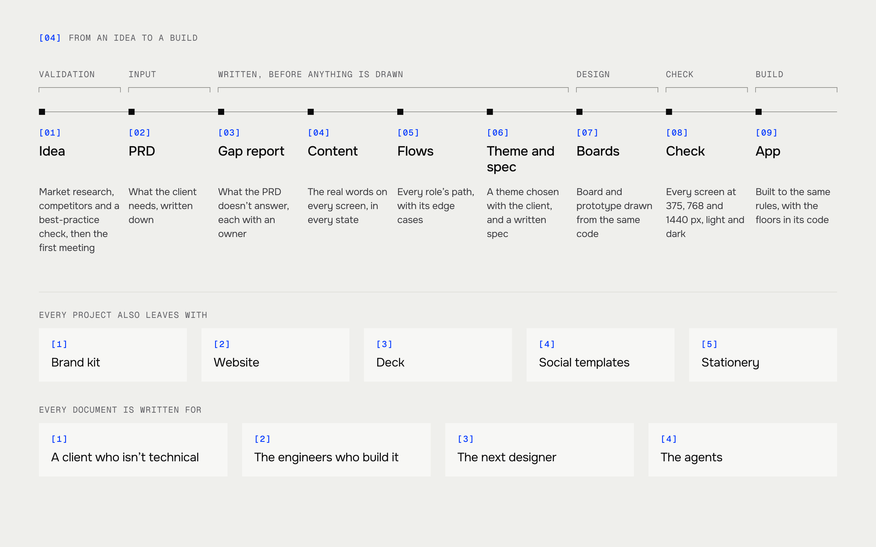
Every document along the way is written to be read by people as well as agents: a client who isn't technical, the engineers who build the product and the next designer who picks it up.
Every project also leaves with its own marketing kit: the brand kit, the website, the deck and the social templates, built on the same tokens as the product.
Then the design. The product is written once as code, and every design board is a render of that code, so a board and the clickable prototype can't drift apart.
Every screen is checked
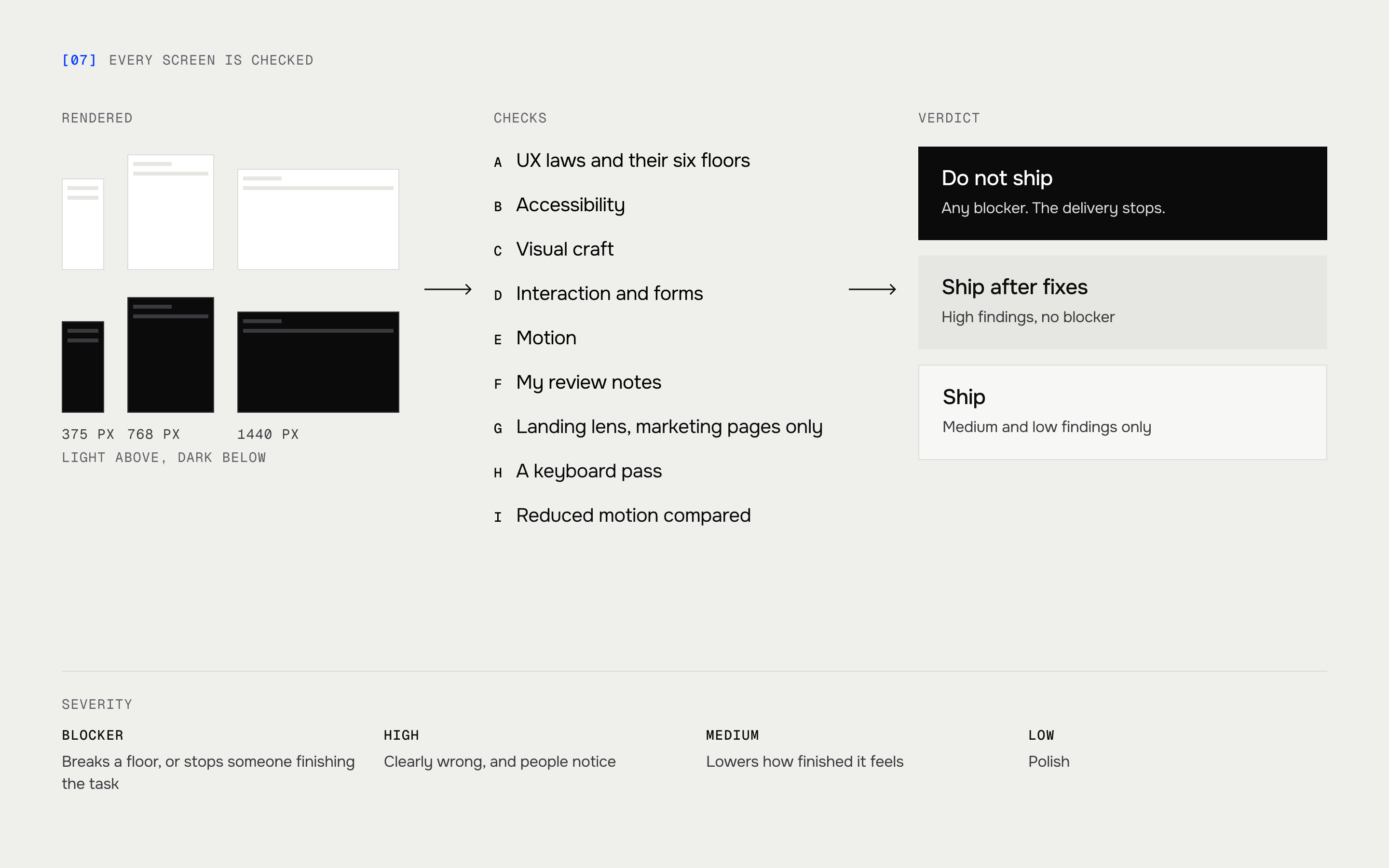
Before anything goes to a client, one check runs on it. It renders each screen at 375, 768 and 1440 pixels in light and dark, does a keyboard pass, compares reduced motion, and reads the result against the UX laws, accessibility, visual craft, interaction, motion and the review notes I've built from my own experience and taste. A blocker stops the delivery.
Outcome
BuildOS takes a product from an idea to a design system of its own: every screen in every state, the website, deck and posts in the same language, and the rules the app is built to. A PRD becomes a themed spec in a day and a full set of screens within a week. Each new product starts from problems that are already solved, and the quality holds whoever draws the screen, an agent or a person.