Renaissance
One brand for Vizio AI and its three studios
Vizio AI used to run as two separate companies. In 2026 it decided to bring its services together as one hub with three studios, and that decision opened the door to a brand identity redesigned alongside the new strategy. I stepped in and designed it.
- Year2026
- ClientVizio AI
- RoleCreative Director, Brand Designer
- ScopeIdentity, website, design system, templates and social media
- Built WithAdobe Illustrator, Claude Code, Figma, Framer
- LiveVizio.ai (opens in a new tab)
In one line
When Vizio AI brought two separate companies together as one hub with three studios, I redesigned its brand to hold that structure and carried it from the logo to the website, the templates and the design system.
Three studios, three missions
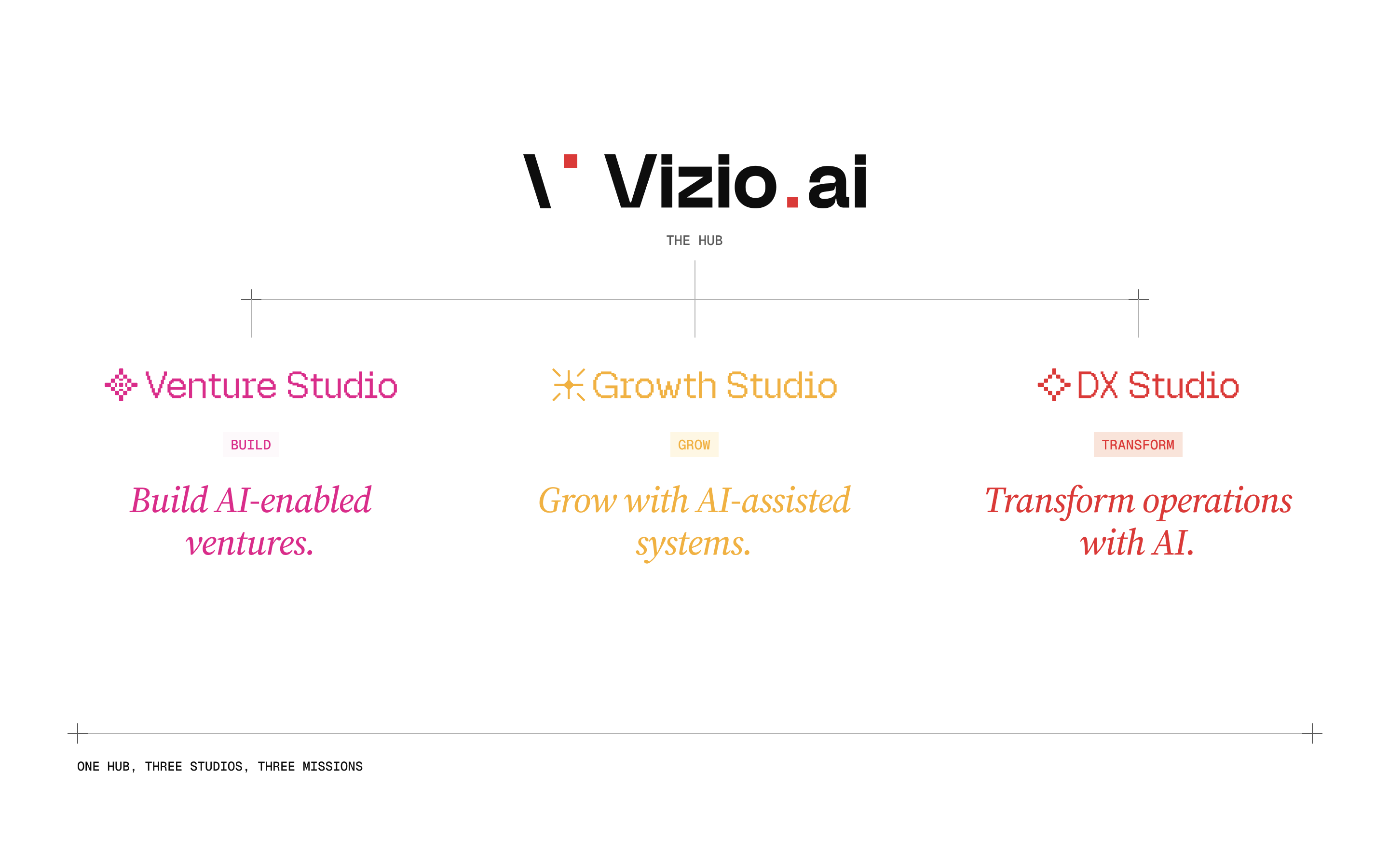
Vizio AI works as one hub with three studios, each with its own mission. Venture Studio builds AI-enabled ventures with founders and operators, from the first insight to launch. Growth Studio gives ventures and product teams repeatable acquisition, outbound and growth operations. DX Studio transforms how companies work, with connected data, automation and AI.
My part was a design language with enough range to show that structure, so the three would look and read as studios of one hub rather than three separate companies.
One lockup for every studio
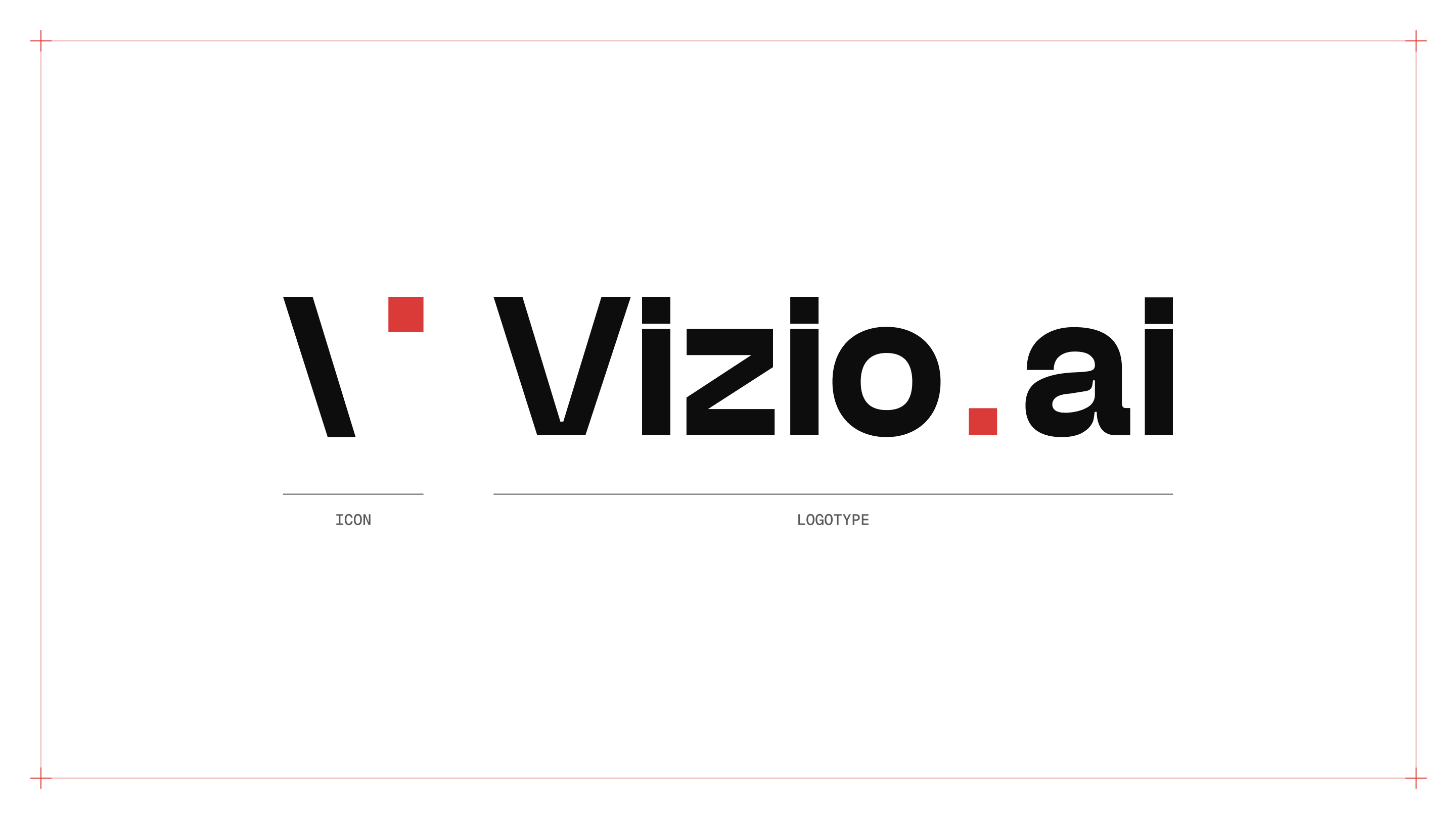
The mark is a backslash and a red square. The backslash comes from code, and the negative space between it and the square keeps the V of Vizio. I wanted the mark as plain as it could be and strong enough to be recognized on its own.
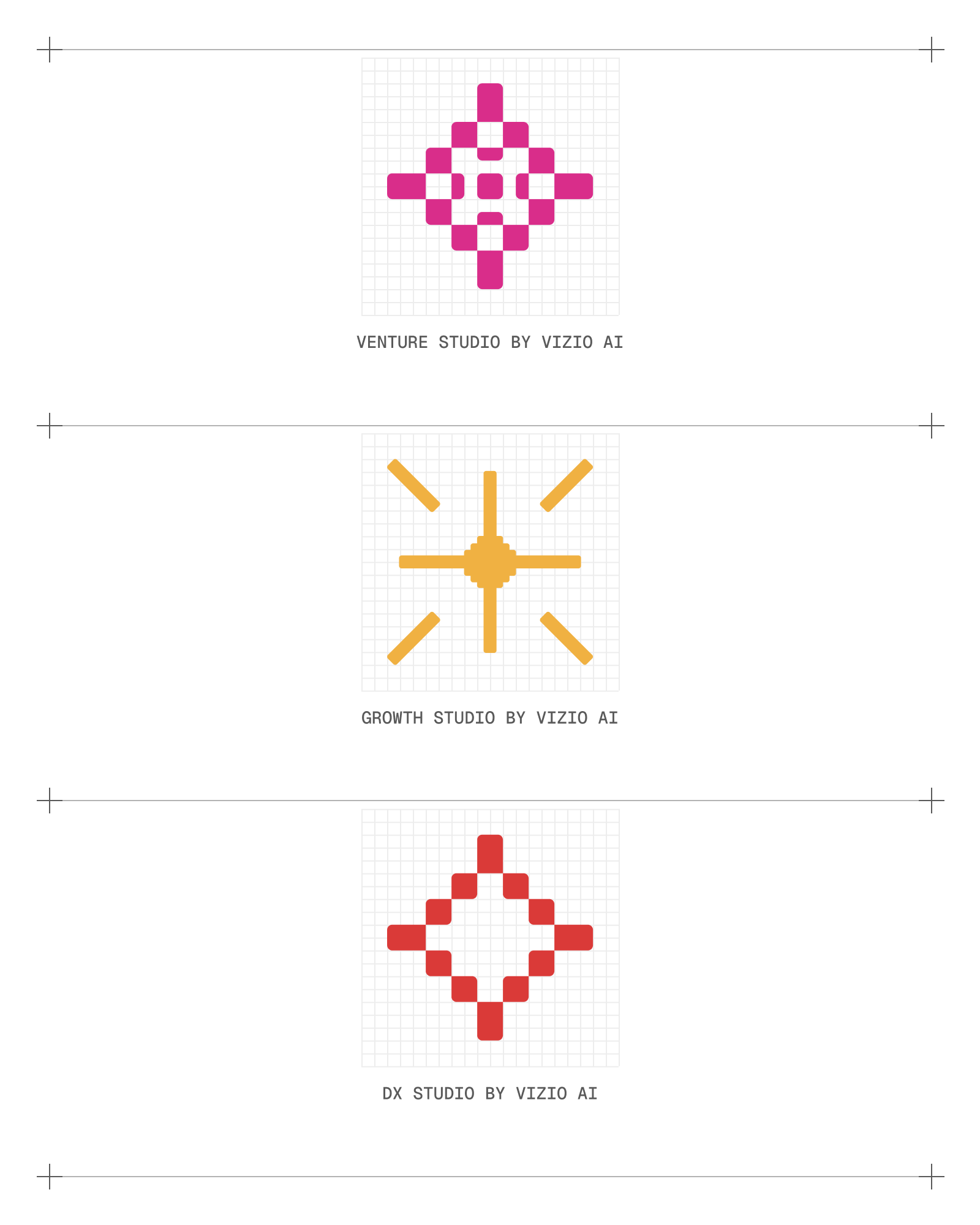
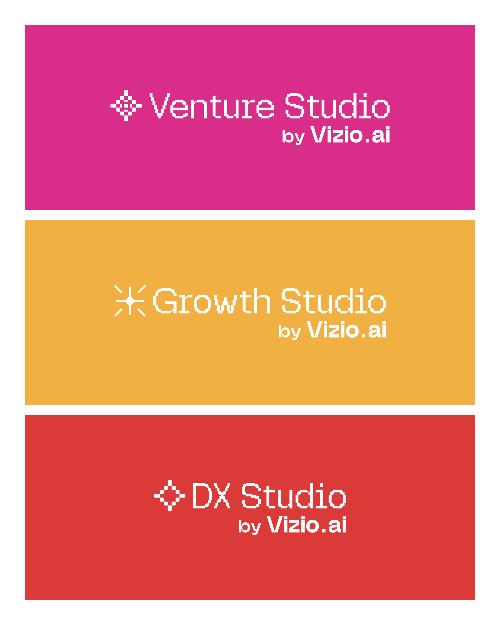
Every lockup is built from the same three parts, the icon, the wordmark and the studio's name, at a scale and spacing that never change. Each studio adds its own pixel icon, drawn on one shared grid. The pixels tie the icons to code and ASCII art, and to the zeros and ones underneath anything digital. Their shapes come from a crosshair, a target, and from the sparkle that has become the sign of AI, and they are built like the motifs of traditional Turkmen carpets.
The red full stop works as Vizio's signature. It closes the wordmark, and the same red point ends every headline on Vizio.ai and every title in the templates.
Type, color and image
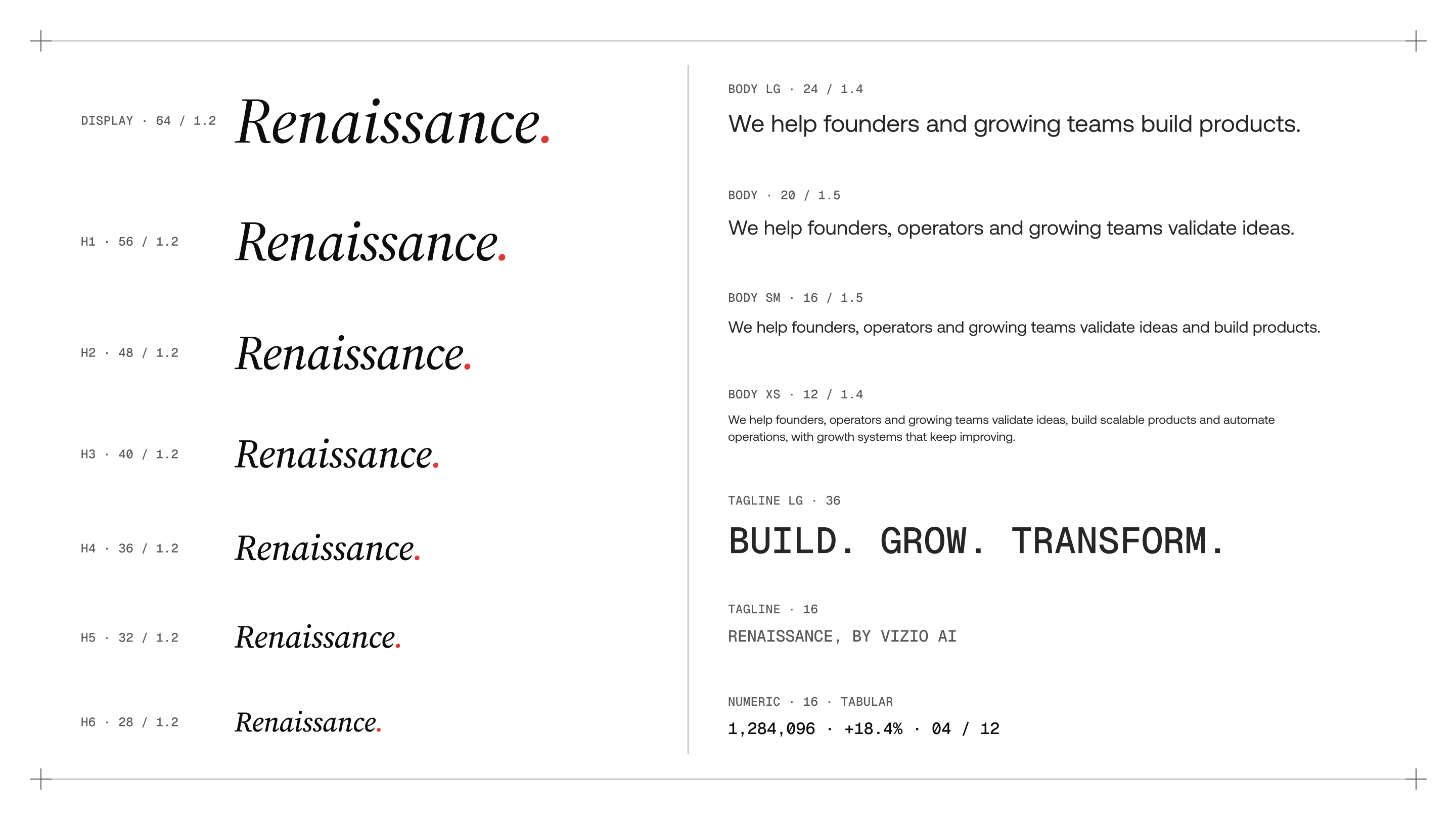
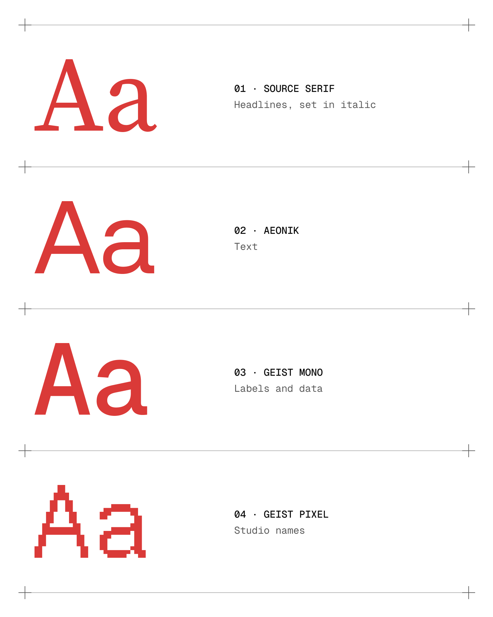
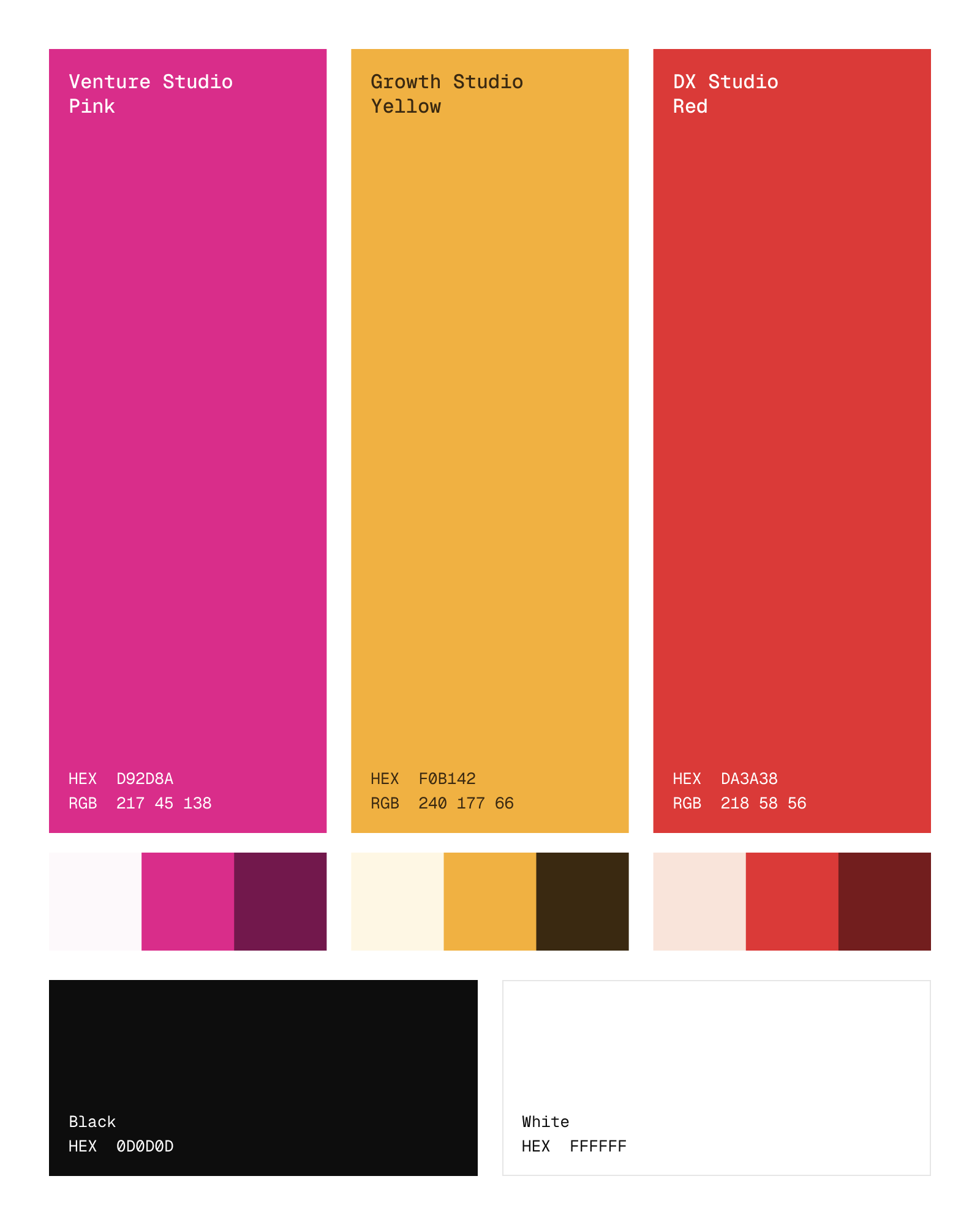
Headlines are set in Source Serif italic, text in Aeonik, and labels and data in Geist Mono. Black and white carry the structure, and each studio owns one color from a wheel that leaves room for the company's products. DX Studio's red is the foundation of the identity, precise and decisive, and it marks actions and emphasis in every studio. Venture Studio's pink is bold and optimistic, the color of turning an insight into a new product. Growth Studio's yellow is warm and ready to act, the color of turning attention into demand.
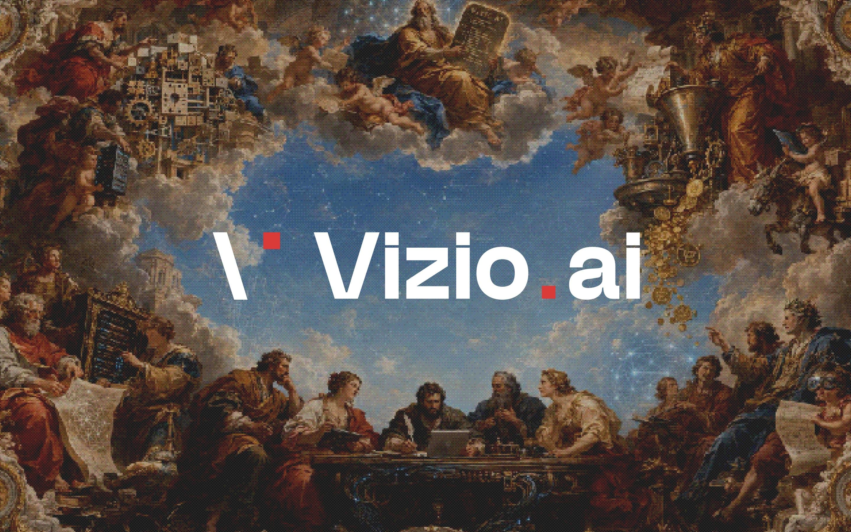
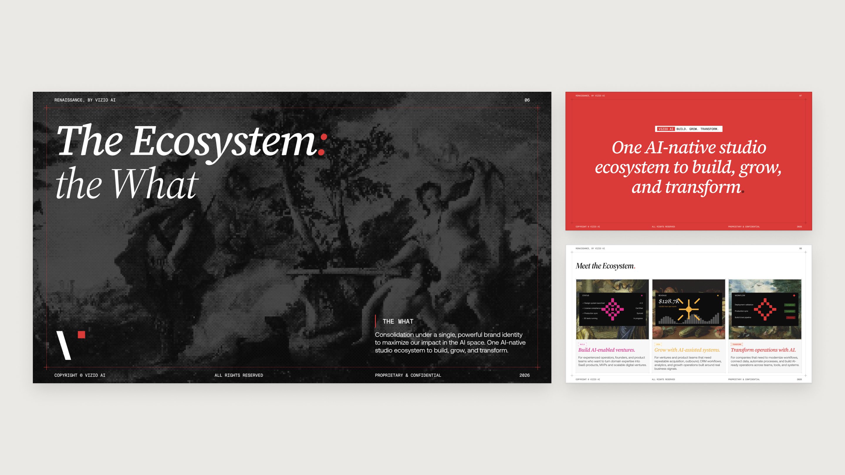
For imagery I used Renaissance paintings and frescoes, pixelated and dithered, with product interfaces and machine parts collaged into them. The paintings give a young company some weight, and the pixel texture ties them to the software it builds.
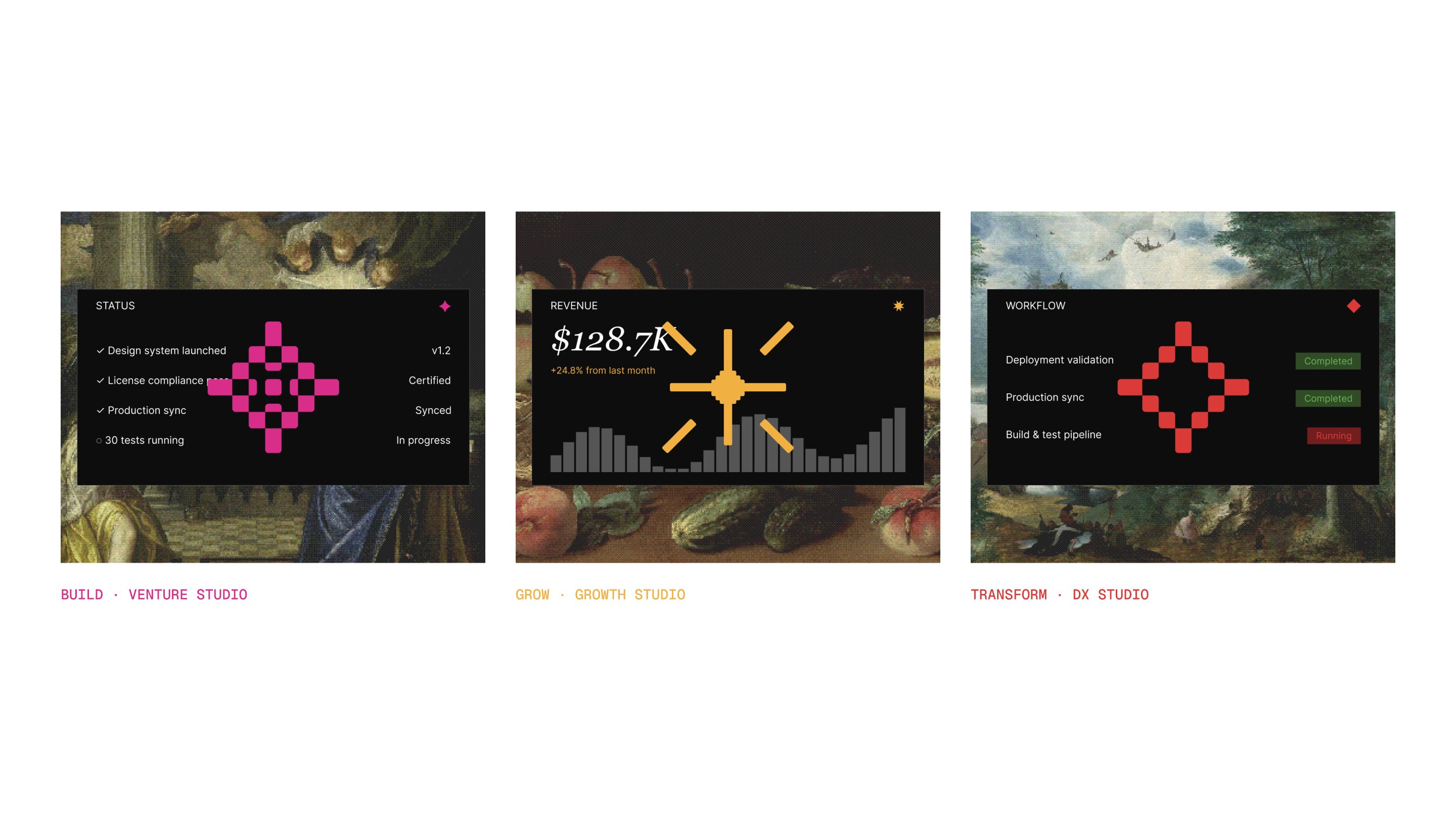
Three studios, one structure
The three studios share one structure. Each is made of the same parts, a lockup, a color, a pixel icon and a painting with its product inside, and those parts sit in one type scale and one grid wherever they appear. The structure stays fixed and only a studio's own parts change, which is what makes it last: it adapts to each studio without losing its shape, and it already has room for the next studio, service or document. The website, the presentation and document templates and the social posts all run on it.
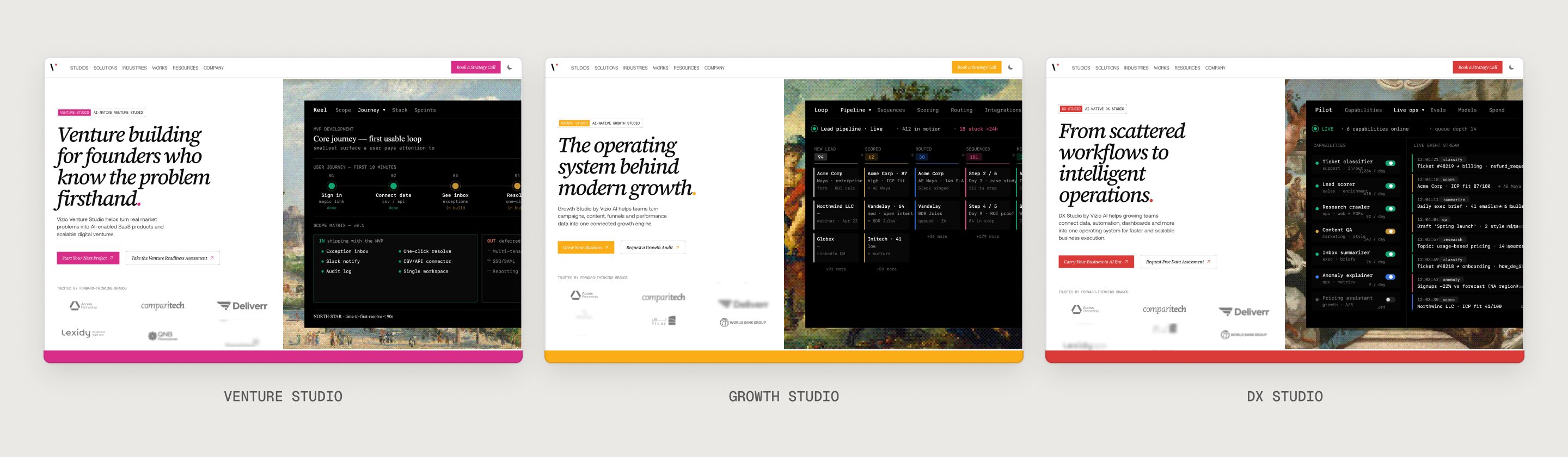
Where it lives
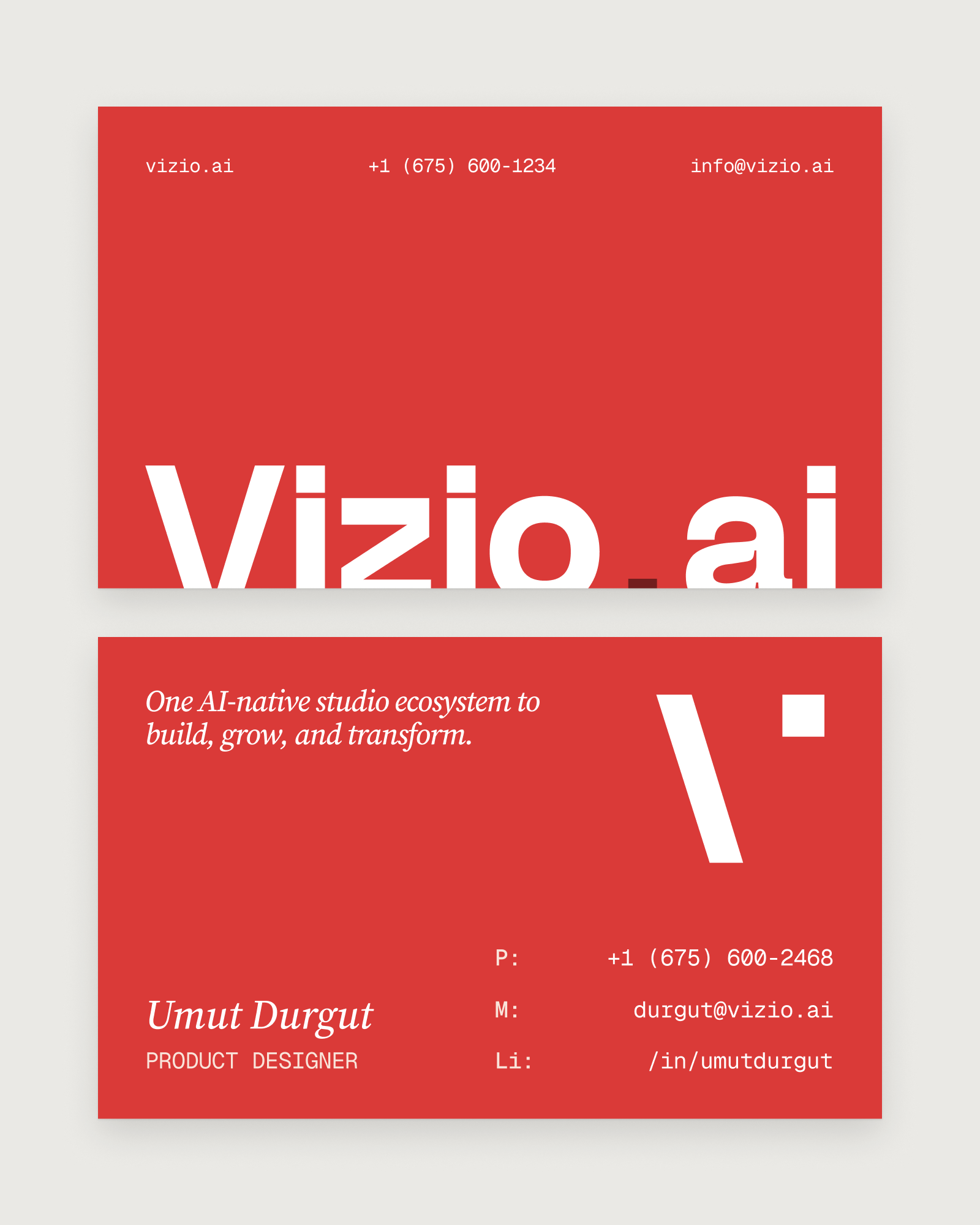
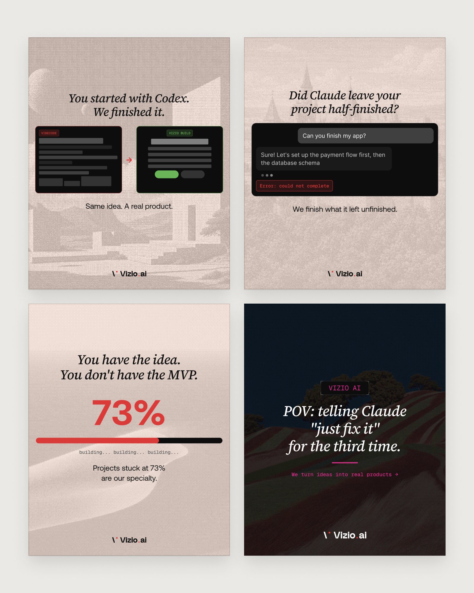
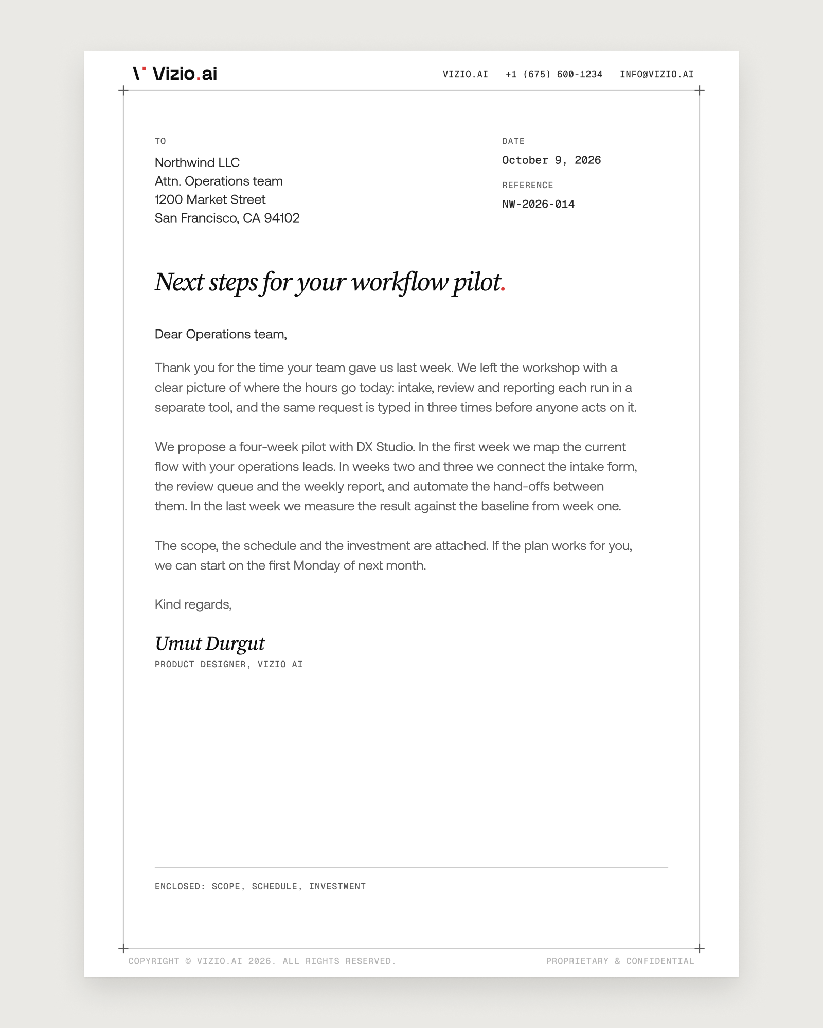
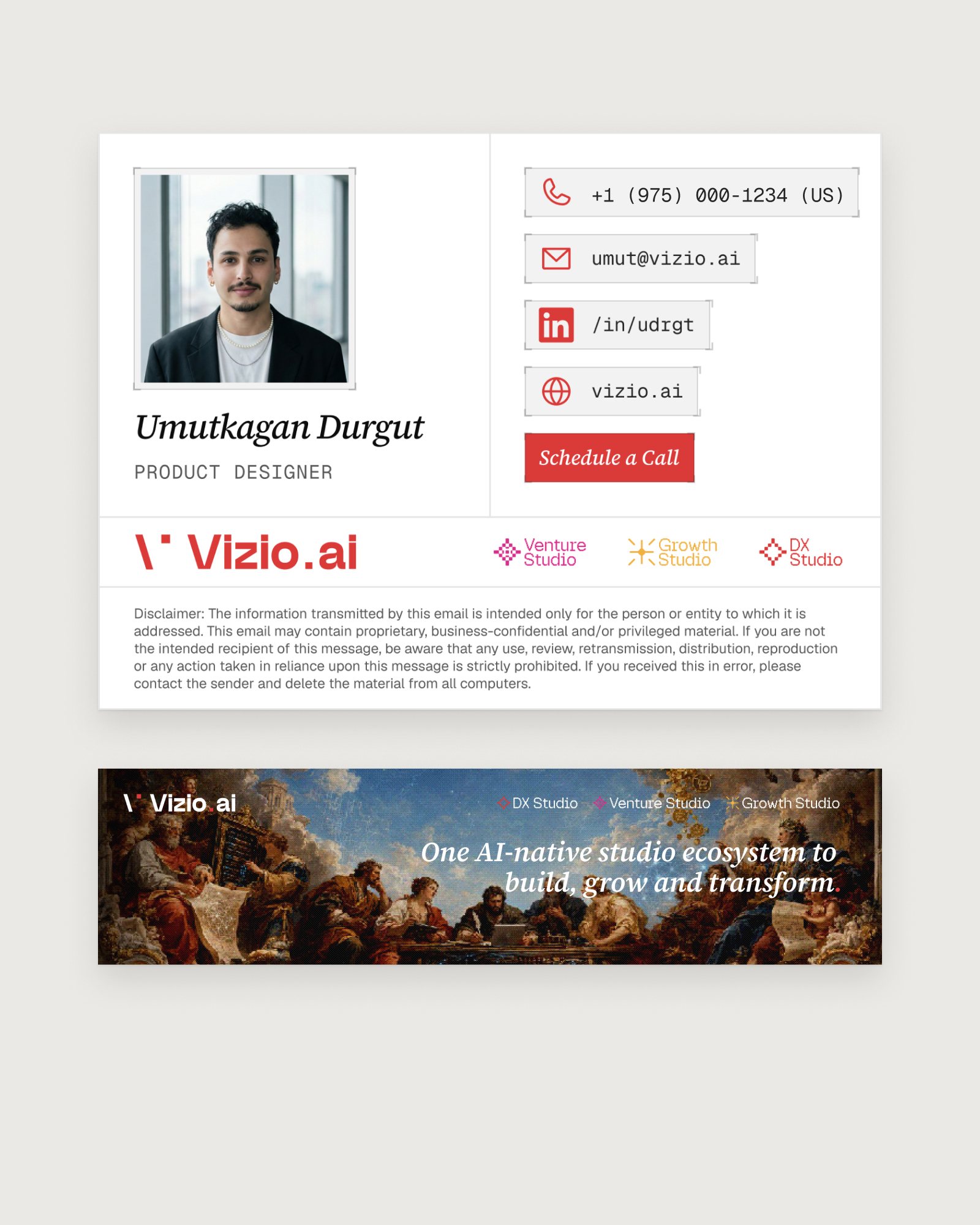
The two old websites were replaced by one, Vizio.ai, which opens with the line the brand was built around: one AI-native studio ecosystem to build, grow and transform. From there the same files ran into business cards, an email signature, presentation and document templates, LinkedIn covers and a set of social posts in square, portrait and story sizes.
Outcome
Vizio.ai now tells the whole story from one site, with a page for each studio, and the two old sites are gone. Everything the company sends out, from a proposal to a LinkedIn post, is built on one design system and speaks one visual language, whichever studio signs it.